

Understanding Responsive Design:

Responsive design is a design approach that aims to make web content look and function well on a variety of devices and screen sizes. This is achieved by creating layouts that automatically adjust and reorganize based on the available screen real estate. With the ever-increasing diversity of devices, from smartphones and tablets to desktops and large monitors, responsive design is no longer a luxury but a necessity.
React: The Foundation:
React is a popular JavaScript library for building user interfaces. Its component-based architecture and virtual DOM make it a powerful tool for creating interactive and dynamic UIs. To begin building a responsive UI, start by breaking down the interface into reusable components. This allows you to encapsulate functionality and design, making it easier to manage and adapt to various screen sizes.
CSS Flexbox:

CSS Flexbox (Flexible Box Layout) is a layout model that provides a more efficient way to design and align elements within a container, even when the sizes of the elements are unknown or dynamic. Flexbox introduces the concepts of flex containers and flex items. By setting display: flex on a container, you can control the alignment, distribution, and order of its child elements. This makes it perfect for creating responsive layouts that adjust smoothly as the screen size changes.
For instance, consider a navigation bar that needs to stack vertically on smaller screens and display horizontally on larger screens. By utilizing Flexbox, you can easily achieve this with minimal CSS code:
css

.nav-container {

  display: flex;

  flex-direction: column; /* Stacks items vertically on small screens */

}

.nav-item {

  margin: 0.5rem;

}
CSS Grid:
CSS Grid is another powerful layout model that enables complex two-dimensional layouts with rows and columns. It excels at creating grid-based designs, and its responsive capabilities are outstanding. With CSS Grid, you can create dynamic grids that adjust column and row sizes automatically, making it a fantastic choice for building responsive dashboards or image galleries.
Suppose you want to create a responsive grid of items, like a product gallery. CSS Grid simplifies this task by allowing you to define the grid structure and item placement using just a few lines of CSS:
css

.product-gallery {

  display: grid;

  grid-template-columns: repeat(auto-fill, minmax(200px, 1fr));

  grid-gap: 1rem;

}
Media Queries:
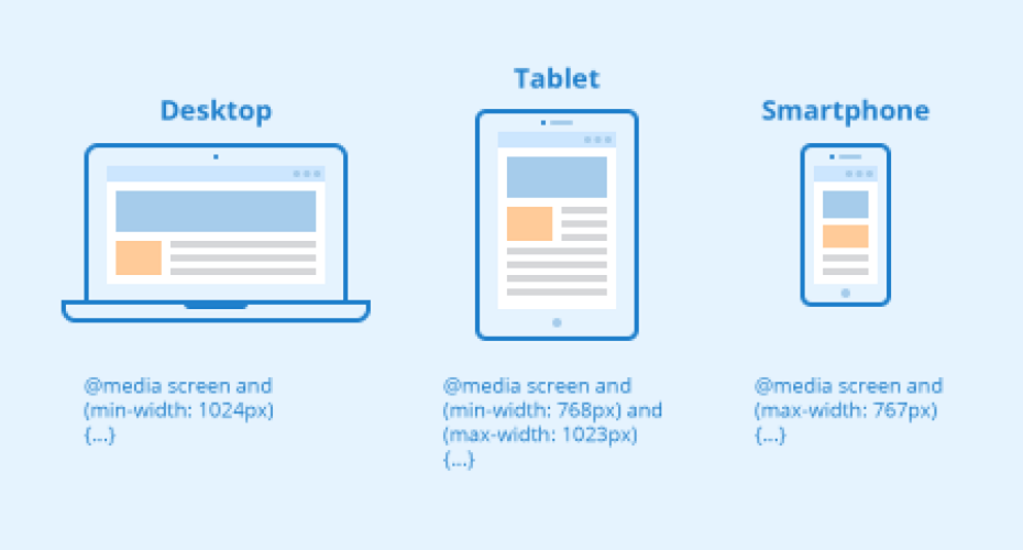
While Flexbox and CSS Grid provide the foundation for responsive layouts, media queries play a crucial role in adapting designs to specific screen sizes. Media queries allow you to apply different styles based on the screen’s width or height, enabling you to fine-tune your layout for various devices.
For example, you can adjust font sizes, margins, or even completely change the layout as the screen width decreases using media queries:
css

@media (max-width: 768px) {

  .main-content {

    font-size: 14px;

  }

}
Putting It All Together:
Combining React, Flexbox, CSS Grid, and media queries empowers you to build highly responsive and adaptable user interfaces. By creating reusable React components, applying Flexbox/Grid for layout, and utilizing media queries for targeted adjustments, you can ensure your UI looks and functions optimally on any device.
Concluding
In conclusion, the ability to create responsive UIs is a crucial skill for modern web developers. Leveraging the power of React along with CSS Flexbox and Grid allows you to build interfaces that gracefully adapt to various screen sizes and orientations. By embracing these technologies, you’ll be well-equipped to deliver a seamless and user-friendly experience across a wide range of devices.

Don't want to miss anything?
Get weekly updates on the newest design stories, case studies and tips right in your mailbox.
